There are times that advance visualizations need few more steps to achieve expected results. Sometimes the requirements limits the default capabilities in Power BI.
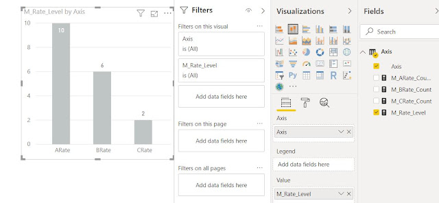
Below is a scenario that you need to show the User measures as axis in a graph. How can we achieve this? Since there is no direct functionality available within Power BI, we need to have a workaround.
1. First write user measures.
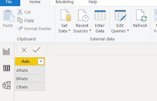
2. Create a new table and name it. (ex : Axis)
3. Write the Axis items that you need to display in the visualization as axis.
4. Write a DAX measure using switch() command assigning each measure to the Axis column item.
M_Rate_Level =
SWITCH (
SELECTEDVALUE ( 'Axis'[Axis] ),
"ARate", [M_ARate_Count],
"BRate", [M_BRate_Count],
"CRate", [M_CRate_Count]
)


No comments:
Post a Comment