Wednesday, 26 February 2020

How to calculate the dates since last incident between two departments as DAX Measure

I came across a situation where i have to indicate the number of days since last incident retrospectively what department they report to. To overcome this challenge i wrote below dax commands to grab any incident on or before the maximum selected date period in the parameter section.

Below is the code i developed and i have provided the comments in each section why i do it. Hope you will read this easily.


M_Total_Days_Since_LastIncident =
VAR maxDate =
MAX ( dimDate[FullDate] ) -- Maximum date selected in parameter date range
VAR maxDEP1 =
CALCULATE (
MAX ( FactDep1Event[EventDateKey] ),
FILTER ( ALL ( dimDate ), dimDate[FullDate] <= maxDate )
) -- Last event datekey for Dep1 on or before maximum date selected
VAR maxDEP1Date =
CALCULATE (
MAX ( dimDate[FullDate] ),
FILTER ( ALL ( dimdate ), dimDate[DateKey] = maxDEP1 )
) -- Find the date associated with dep1
VAR maxDEP2 =
CALCULATE (
MAX ( FactDEP2Event[EventDateKey] ),
FILTER ( ALL ( dimDate ), dimDate[FullDate] <= maxDate )
) -- Last event datekey for Dep2 on or before maximum date selected
VAR maxDep2Date =
CALCULATE (
MAX ( dimDate[FullDate] ),
FILTER ( ALL ( dimdate ), dimDate[DateKey] = maxDEP2 )
) -- Find the date associated with dep2
RETURN
IF (
ISBLANK ( maxDEP1Date ) && ISBLANK ( maxDep2Date ),
"-",
IF (
maxDEP1Date >= maxDep2Date ,
DATEDIFF ( maxDEP1Date , maxDate, DAY ) + 0,
DATEDIFF ( maxDep2Date , maxDate, DAY ) + 0
)
)-- Compare which date is closer to maximum date and display

How to calculate the actual interval boundaries between months using DATEDIFF in DAX

When i was writing a DAX code to return the difference between dates in months i found DATEDIFF function is very useful. But when i found the visualization sometimes does not produce expected results, after analyzing i found that if the selected date period is fallen in same month but from first date of the month to the last date of same month, datediff for Month shows 0.


How  do you get the month difference if the difference between two dates is less than a month?

Below is the DAX code that you can use to get more accurate figure for interval boundaries between dates. If you want to see the exact number it produces then reformat to decimal places and see how code behaves.


M_PY_Rate =
VAR startDate =
CALCULATE ( MIN ( dimDate[FullDate] ), ALLSELECTED ( dimDate[FullDate] ) )
VAR endDate =
CALCULATE ( MAX ( dimDate[FullDate] ), ALLSELECTED ( dimDate[FullDate] ) )
VAR diff =
( 1
* ( endDate - startDate) )
/ DAY ( EOMONTH ( endDate, 0 ) )
--DATEDIFF ( endDate, startDate, MONTH ) (Archived)
RETURN
CALCULATE (
[M_SI_RATE],
PARALLELPERIOD ( dimDate[FullDate], -(diff), MONTH )
)

How to show user measures as axis in Power BI

MS Power BI has become a popular visualization tool because it's easier to use by non technical users as well. Power BI users can drag and drop visualizations onto the report and select the Axis and Values in the graph to show insights.

There are times that advance visualizations need few more steps to achieve expected results. Sometimes the requirements limits the default capabilities in Power BI.

Below is a scenario that you need to show the User measures as axis in a graph. How can we achieve this? Since there is no direct functionality available within Power BI, we need to have a workaround.

1. First write user measures.
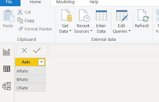
2. Create a new table and name it. (ex : Axis)
3. Write the Axis items that you need to display in the visualization as axis.
4. Write a DAX measure using switch() command assigning each measure to the Axis column item.


M_Rate_Level =
SWITCH (
SELECTEDVALUE ( 'Axis'[Axis] ),
"ARate", [M_ARate_Count],
"BRate", [M_BRate_Count],
"CRate", [M_CRate_Count]
)
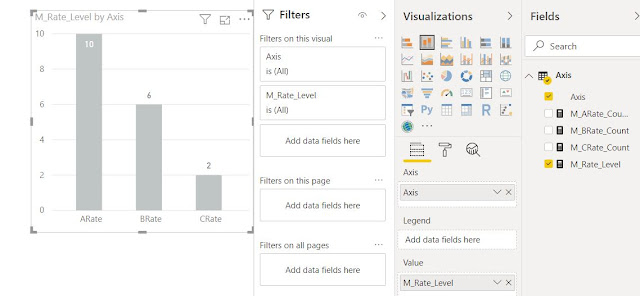
 Now you can see the user measures are shown as x-axis and values are shown on Y-Axis

Use Ranking to eliminate similar items get selected for TOP N using DAX

MS Power BI improves it's capabilities and evolve in every sprint. It's a very common visualization tool that comes with handy functionalities.

When using charts in Power BI, it provides the option to the developer to select top 5 records to limit the selections. This is a vary useful functionality that any developer is looking for!

When i was doing my report, i found TOP N filter gives a greater release to limit the selection. But i found another challenge. When there are different records with same value then this filter can't limit it's selection exactly to what it is set for.

As an example i need top 5 students score in a graph.

Student ScoreTop
A707
B754
C725
D803
E725
F902
G725
H951
I707
J716

When i choose the filter and limit the top 5 students, the graph shows me 7 records like below.

Student ScoreTop
H951
F902
D803
B754
C725
E725
G725
But i Really needs only 5 records no matter who else have the same score like below.

Student ScoreTop
H951
F902
D803
B754
C725
To resolve this issue DAX comes pretty handy. I used Ranking to rank each record so i can filter the top five records. I wrote my measures like below.

M_Scores =  DIVIDE (SUM (dimClass[Marks]) , 10 , 0)

M_Rank = 
RANKX (
ALLSELECTED ( dimStudent[StudentName]),
[M_Scores]
+ INT ( CALCULATE ( MIN (dimClass[Marks]) ) ) / 100000,
,
DESC
)


I then dragged and dropped the Ranking Measure i created into filter area and i set the item value to less than or equal to 5. 

What this Ranking measure does is it randomly assign the calculated number and make every item unique. Similarly you can also link this with date and time value to make the ranking unique.